Poster
This is the first poster I designed. First of all, some warmer tones are used in the picture, among them are more tender pink and beige, and more tender blue, I hope this color can make the whole look more fresh and energetic, because this poster is a representative of our whole class. As well as the name and type of our school, which introduces more detailed courses respectively, I think this can express the information very comprehensively and completely, as well as very neat and eye-catching. The colors overlapped with the blue I did an interweaving to make the colors look easier to dissolve and to make the poser look smoother as well as layered and the color aspect done more smoothly.

The theme of the second poster is try something new, it represents my desire to try something new, to explore their own unknown areas, more inspiring to continue to try new things, and out of the comfort zone. This I used a lot of purple as the main tone. The elements of technology seem to be very mysterious and mysterious to represent this feeling of exploring into the unknown.
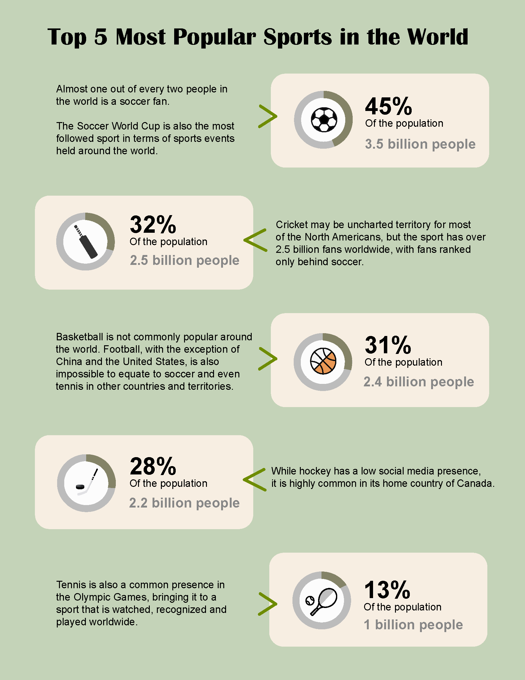
The third one is a design I created between the poster and the small icons, in which I went through a survey and then divided some fields, and I layered them carefully to better optimize the content of the message I wanted to express. The icons and the text complement each other, they contribute to the harmony of the picture, which can explain the poster in more detail.